
Local Data
Blending styles and symbols for a
leader in research-based storytelling
leader in research-based storytelling
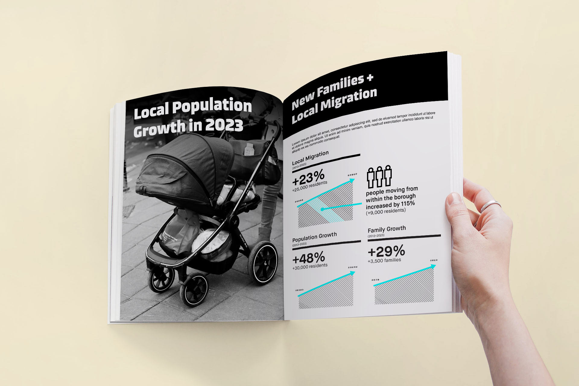
Local Data, a research and marketing firm based in New York City, is a powerful player in the world of community non-profits and local development corporations. Harnessing demographic data to help organizations better understand the areas they serve, the agency uses those numbers to weave a story and develop vast libraries of marketing materials.
With resources strained by client work, its identity needed a refresh to better convey its outsized impact on the city. Looking to project an air of fresh energy in an ever-changing city, the company needed a brand to match its current reputation—and allow it to grow with ambitions for the future.


Contrasting typographic styles echo the firm's two-pronged approach: a research and insights phase that pieces together a puzzle of government and demographic data, leading to the design and publishing phase where the story is articulated, polished, and made ready for the boardroom, the printer, or a billboard.
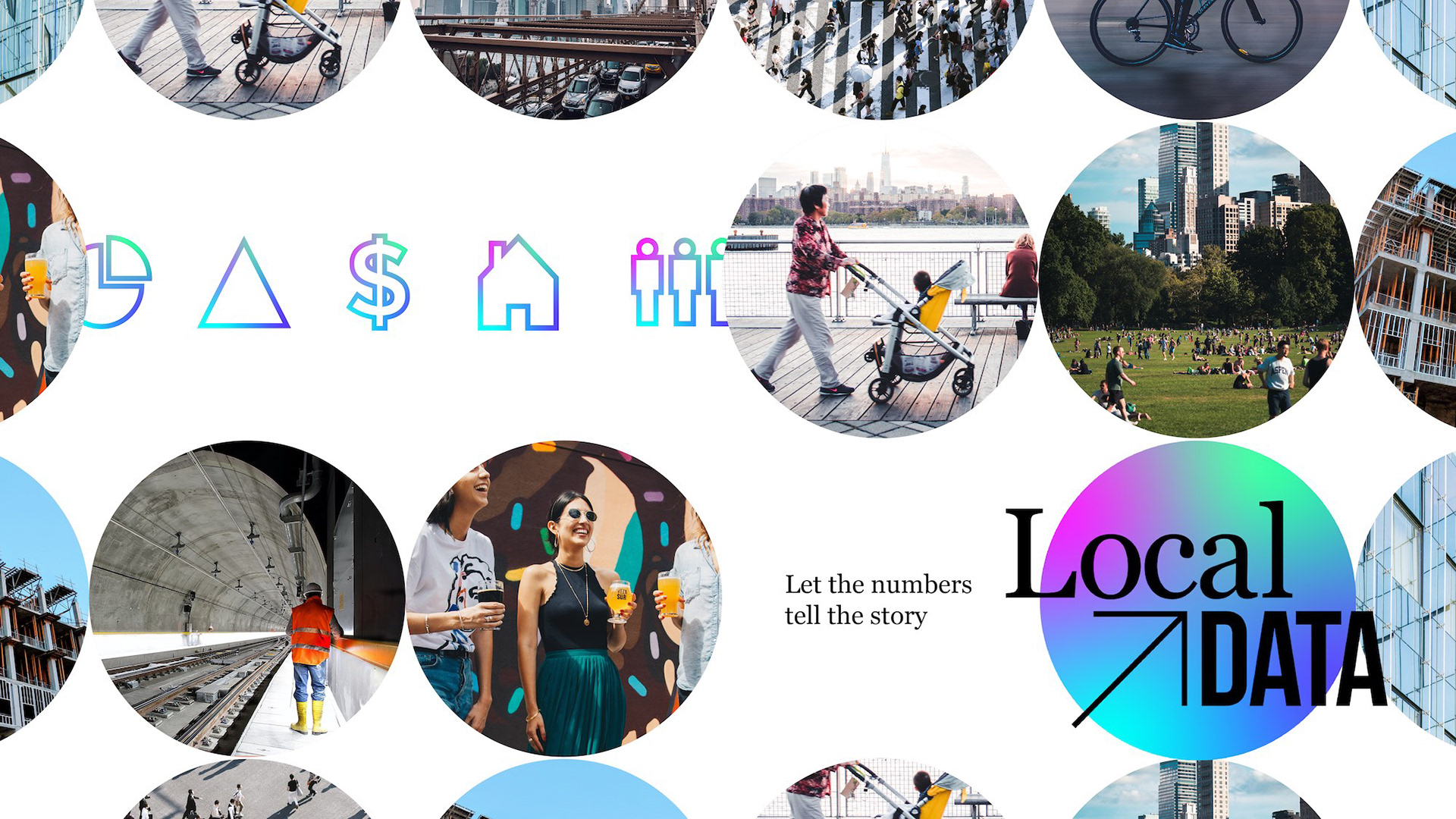
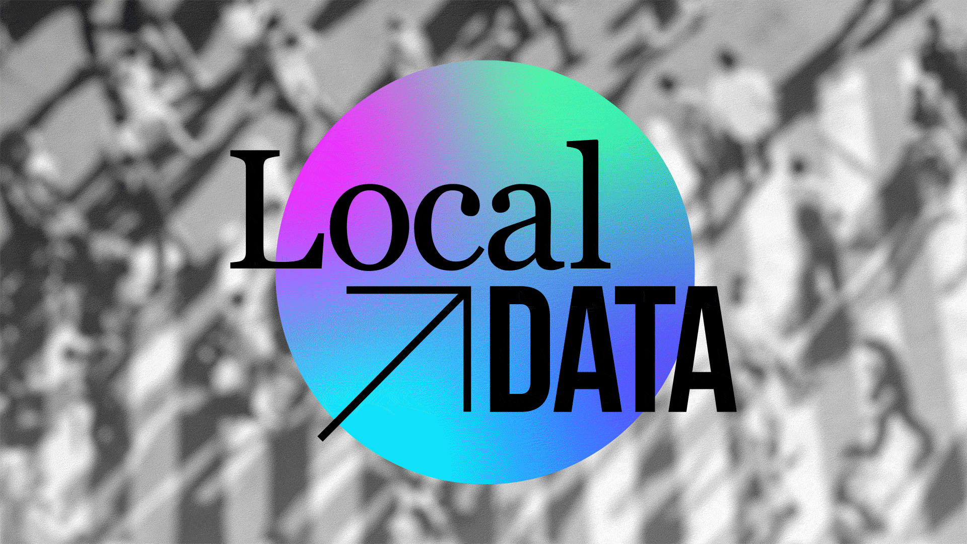
Representing a glimpse into a colorful ecosystem of information, the sphere features a main gradient (as seen in the logo) and alternate gradients—a visual nod to heat maps and the varied nature of data.
The semi-spheres are another element of the visual identity that can be used to complement the main sphere or on their own. Aside from their visual interest, they also serve as a reminder that data and storytelling are two halves of a whole—one incomplete without the other.

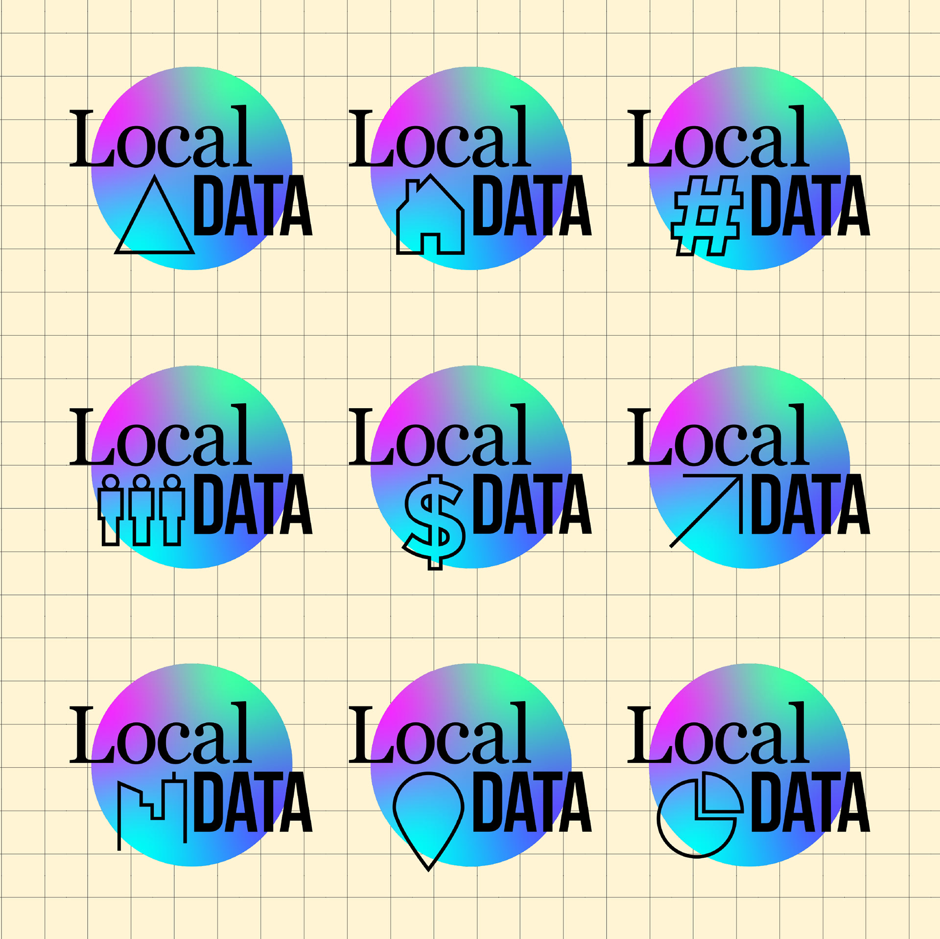
A library of symbols are used in the animated version of the logo and also serve as a handy reference guide to the firm's capabilities and most popular data points. From financial data to population segments, the symbols are a visual language that unifies the agency's multi-pronged methodology and underscores its approach: clear, focused, and modern.